“There are moments in our lives,
there are moments in a day
When we seem to see beyond the usual …”
–Robert Henri
Rez Williams’ paintings are definitely not “the usual.” Although of a certain Vineyard tradition in their stylized, energetic depiction of the landscape with vigorous brushwork and patterns — think of Thomas Hart Benton, Nancy Furino, Ken Vincent — they are definitely a personal interpretation, and completely in service of making a painting, not a mere recording of a place.
As with many artists, Rez’s work has naturally divided itself into periods of intense exploration of a particular subject. There were Vineyard landscapes that Thomas Hoving, then director of the Metropolitan Museum of Art, described in a 1995 issue of Cigar Aficionado magazine as “smash[ing] into your eyes like crescendos. The spaces warp and move. The colors clash and rebound.” A trip to Venice in 1996 engendered a series of cityscapes. By the late 1990s, Rez was sailing to and painting fishing boats in New Bedford Harbor, a subject that absorbed all of his attention for many years, until a trip to Ireland in 2014 reawakened his interest in painting the landscape around him. For the past two years, that attention has focused on Monhegan Island, off the coast of Maine.

“Tidal Pool” oil on canvas 52 x 66 inches
Monhegan has been considered an artist’s paradise since the middle of the 19th century, when artists such as the above-quoted Robert Henri were attracted to its isolation, its rugged landscape, and its clear light. Rez initially called it “basically all trees and rocks,” following his first visit there, when during a drive through coastal Maine in 2016, he and his wife — the artist Lucy Mitchell — serendipitously pulled off the highway and onto a ferry.
How to turn it into something? That is the eternal question artists ask themselves. It was definitely a challenge, to take that scruffy, chaotic mess of downed, dead trees with bare branches going every which way and rampant undergrowth twining and vining beneath, over, and through it. Still-majestic pines grew ever skyward. Rocky outcroppings carried the eye to far-off spaces, or stopped that same eye with a huge and solid presence that blocked out everything else. The ocean surrounded it all.
Rez took photographs on that trip, of that place where he considered himself to be “trapped there, and presented with that chaotic greensward. I had to fish or cut bait.” It turned his mind to making those images become more than what they appeared, more than he initially saw in it. Back in his studio, Rez scanned the photographs, enlarged them, printed them out “on crappy paper,” the beginning of the visual study that is his work process. They become just the barest reminder of where he had been and what he saw. He takes it from there, the challenge being to make some sense out of this clutter of raw pictorial possibilities, to discover the abstract possibilities that will excite him and become a series of paintings of worth and distinction.

“Rock and Shadows” oil on canvas 52 x 66 inches
If you saw Rez’s first exhibition of Monhegan paintings last year at A Gallery, you would know they were not the typical, expected plein air paintings of iconic buildings set against dramatic or clear blue skies, or of artists singly or in groups painting their landscapes. That is not to denigrate those paintings, many of which are masterful and by artists of note. It is just to say that Rez Williams’ work is of a different sort. There are no buildings at all, no sense of the original town that grew from fisherman’s shacks into a collection of guesthouses and hotels and new homeowners’ rose-covered cottages, as artists and visitors came and where some stayed to become year-round residents. Rez’s paintings have more of a primordial feel of places untouched or unseen before.
The first painting I saw was called “Morning Light,” the second version of a painting from a year ago. The first one was all hard and spare, of sun patterns on water and rocks that appeared impossibly adorning this barren wasteland. In the second version, the artist had stepped a few inches or feet away, reorienting the view to a warmer place of roundness and fresh greenery, the edges of a newly leafed-out tree in contrast with the pair on the left that were barely breaking into bud after the long winter. There were even some pale yellow flowers in the foreground, although they were also a device to strengthen the series of diagonal lines pushing your eye off the cliff and into the drink. The painting combined all the incongruities of Rez’s work. It brought the viewer into deep, perfectly one-point perspective space, as though you could walk out along those rocks to gain a better sighting of waves and sea. Yet much of it remained rather flat. The sky and green foliage barely intruding into the picture, the boulder rising at the far side of the outcropping, even the woodland those rocks overlooked, all dissolved reality into patterns of colors and shapes and edges of painted colors butting hard against one another or softly disappearing.

“Single Tree” oil on canvas 52 x 70 inches
That’s another signature of Rez’s style, that juxtaposition of contrasts. I think of Rez as a hard-edge painter, which he was as a young artist in New York City back in the late 1960s and early 1970s. Yet he will often impose an area of such lyrical loveliness into an otherwise flat and daunting scene. Those incongruities exemplify his wit and his talent, the spark that pushes his paintings beyond the obvious, the challenge that keeps him interested and pushing his own limits.
Rez described the impetus behind the painting “Pink Landscape” as an answer to the question he asked himself one morning in his studio. “What would be the most despicable thing you could do to a landscape? Paint it pink.” And it is. Neither a baby girl’s nursery pink nor the shade of bubblegum or Pepto-Bismol, the dominant pink in Rez’s painting is some unsettling shade that veers toward red in its most potent iteration, the large rock form that dominates the composition. It pushes off the canvas on both sides, too big to be contained by mere spatial parameters. It’s set into an unexplained paler, grayed-down pink place. I say “place,” as it could be waves or a shrubby field or other rocks lower in the view. Contrasted with all this pink is its complement, green. Although the greens are really complicated mixtures of those complementary colors producing subtle and odd grays. Place them against those outlandish pinks and they pop. Or soften. Contradictions. The background of “Pink Landscape” is a layering of gray-greens in a quiet pink sea. It could be a classically beautiful landscape but for its placement behind the most outlandish foreground. The whole of those seemingly disjointed parts is a work that will pique, and then hold, one’s interest forever.

“Rocks” oil on canvas 52 x 66 inches
“Tidal Pool” and “Wave Surge” display a similar set of contradictions, of interplay between solid and vaporous. Both are close views of rocks in the water. No sky or land forms place those rocks in any literal context. In “Tidal Pool,” blue water swirls and eddies in a sparkling whirl of sunlight and broken brush marks. In “Wave Surge,” the water darkens in the distance, lightening to white as it hits up against the rocks with their mouldering algae-coated lower edges exposed at low tide. Not really mouldering algae, only a device to introduce the ochre colors that contrast against the purple-gray color of the wetted rocks.
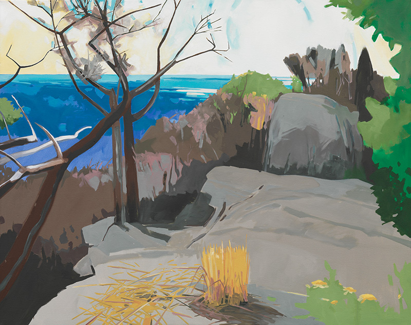
“Rock Shadows” is the oddest of all. It’s almost a witticism of a painting, or a painting of a wit’s amusement at observing a pleasantly ordinary summer day. It’s the lightest in color values of all of Rez’s new paintings. The rocky outcroppings are hit with sunlight, the shadowed sides a combination of violet and a wonderful something vaguely ultramarine. Set into a grassy spot that would be perfect for a picnic, these rocks carry nothing of the ominous lurking danger of some of the other paintings. One could easily climb up for a comfortable seat or to be a bit higher for a better look at an ocean no more dangerous than a shallow pool. Trees behind the rocks provide some shade, green leaves to carry the greens in the foreground upward and to give the artist an opportunity to define the branches of one tall evergreen with the most beautifully painted negative spaces.

“Pink Landscape” oil on canvas 38 x 48 inches
In contrast to that sunny scene is “Rocks,” as sharp and spare a painting as ever was. The painting is of a grouping of rocks leading one into a dark abyss, a background that appears completely black. There is a bit of sunlight hitting them in the foreground, but it’s to lead you into the painting, not to offer any visual or imaginary comfort. The greens in the jutting branches of foliage are fairly close in value to the surrounding rocks in some places, dark against light or light against dark in others, distant enough to offer no handhold in the event of a fall. A peek of ocean at the left is the only nod to an end to the unremitting hardness of what lies in front of you.
One comment to viewers is to notice the use of white and black in these paintings. Rez switched many years ago from lead white, which discolored and turned yellow very quickly, to the more stable titanium white. Still, it’s unusual to see pure white in a painting, especially a landscape. Same with pure black. Manet used it, but the Impressionists eschewed its use, as did most painters into modern times except for a few Abstract Expressionists. Kline and Motherwell come to mind. Rez said that he sees white as a color. He uses it most effectively, making it more of an intrinsic part of the composition than only as an occasional highlight. The latest Wolf Kahn paintings and pastels have incorporated white in much the same way. Just an interesting aside. Artists are all tied together in many ways.
To further comment on Rez’s use of color, I have always thought of his paintings as rather bright. It is a tribute to his abilities as a mixer of paint, both to devise the colors themselves, and to lay one next to the other in a way that enhances the qualities of both. That said, he describes his colors as “rather dour, dull.” Oddly enough, they are. Looking at the array in his studio, I was surprised to find mostly earth colors: Winsor Green, Sap Green, Burnt Sienna, Prussian Blue, Indigo, Bismuth Yellow, Mars and Venetian Reds. “I’ll occasionally pick up a strange color in the art store,” he told me. Look at his paintings and admire the range and diversity he makes with those “dour, dull” components. I am in awe, especially since so many modern colors exist that look remarkably like the colors Rez has come up with on his own.
He also admits to enjoying what he calls “a seat of the pants” approach to color. He says, “Oftentimes, when questioning a painting in progress, I may ask, ‘What crazy color will make this painting dance?’ and act accordingly. At other times I may lay on a color that screws everything up, but may lead to other, more important unseen mistakes. Like juggling, there are a lot of things flying around, and it sometimes amazes me that anything coherent emerges. And sometimes nothing does.”
His paintings are almost all large, 52 x 70 inches or 52 x 66, “big enough to encompass the viewer,” he says. They all do present themselves as accessible in that way, that the viewer could easily approach the painting to look at it closely, then continue walking right into its depths. Rez calls those sizes his “comfort zone.”
At the beginning of a new painting, the canvas is hung on his studio wall. Rez draws in charcoal to lay out his thoughts for the basic composition. Horizon line here. A stand of trees. A large rock. The original drawing-in feels loose and directional. Basic. “The very cursive charcoal drawing sets up the first proposition — with future possibilities of form/space interaction. This game of action/consequence, interrogation/answer continues more or less until no further action is needed or until I’ve painted myself out of the painting.” That is Rez’s excellent description of his painting process, which he likens to a board game “where the rules of the game are opaque but the moves are decisive.”
When I first visited Rez in his studio, he pointed out a quotation that hung on the wall above his painting table. It had obviously been there for some time, and was often read and reread, the edges of the paper curled and darkened around the anchoring thumb tacks. It was an unsourced quote from an old issue of Art New England, dated February 1989, and reads, “Later, he moved away from appreciation to explore an extended range of issues from Expressionism to attempts to achieve balance, between a painterly use of the brush and surface of the canvas, with a desire to incorporate abstract elements.”
That is the place most artists inhabit, unless they are totally nonrepresentational or obsessively realistic painters. The very best days of painting are when that pinpoint, that place of perfect balance, between what the eye sees and the abstract elements of making a work of art, come together and flow easily from the brush onto the canvas.
Rez Williams has been living and painting on the Vineyard since the 1970s. His first one-person show of pencil drawings and paintings was at the Art Workers’ Guild in 1976. In subsequent years, he has exhibited at the Field Gallery (with Jules Feiffer), Doug Parker’s On the Vineyard, Mary Etherington Gallery, Carol Craven Gallery, and at A Gallery since its inception in 2012. A selection of his work will be there this summer at A Gallery’s new location, 510 State Rd. in West Tisbury. He has had two museum exhibitions, at the Institute of Contemporary Art in Portland, Maine, in 1999, and at the New Bedford Museum in 2001. You may also look at his website: rezwilliams.com.
Hermine Hull is the artist/owner of Hermine Merel Smith Fine Art, 548 Edgartown–West Tisbury Rd., West Tisbury. She writes the weekly West Tisbury column for The Martha’s Vineyard Times, and articles about art and artists for The Times and Arts & Ideas.
Leave a reply